

That’s it – I’ve had it. I can’t sit on this anymore. Gmail now has over 1 billion monthly active users, and it could very well be the shittiest UX I have ever seen. At this point, I think it’s intentional; they know how brainlessly addicted people are to their gargantuan brand (or like me, they’re forced to use it through work), so they’re taking the opportunity to let off some steam and fuck with us. Sort of like a drug dealer charging a junkie a subscription fee.
Except this is worse because people continue to voluntarily sign up for the service to handle their personal communications – and it blows my mind. As far as user experience goes, Gmail is literally the worst email client alternative, and yes, that includes Yahoo! Mail, you fucking knee-jerk-to-hate-anything-that’s-sort-of-old-and-irrationally-obsessed-with-useless-power-user-minutia-fanboys.
So I’ll just jump into it. I’m not going to whine – I’m just going to show you why the Gmail interface is the digital equivalent to a microwave full of bear shit. After half a lifetime of using a broad range of email clients and popular software applications, and almost a decade of professional Product Management experience working with people way smarter than me to design thousands of our own software experiences, here is why Gmail is the world’s shittiest UX.
(And let me preface this by saying that the only configuration I have ever done to this account, from the desktop interface, is disabling the worthless hell-spiral that is “Conversation” view. Everything else you see came as a default.)
The Basics: Replying to A Message in Gmail
Let’s start with the simple stuff: I want to reply to a message. We all know how that works, right? You open a message, you read a message, you respond to a message. Pretty straight forward stuff, and there are only a few things you have to get right as an interface designer. Gmail gets about none of them.
Here is an email to which I want to reply:

So far, so good. Then, here’s what happens when I hit “Reply”:
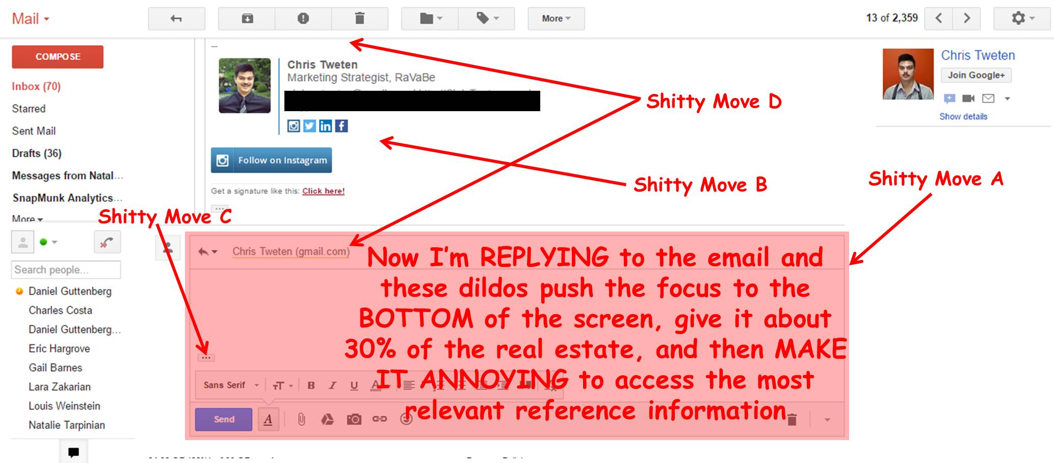
It’s like I started filming Shawshank with Morgan Freeman as Red, but then half way through the shoot, we ran out of money and had to replace him with Cuba Gooding Jr.’s character in Radio.
Let’s go through in order:
Shitty Move A
All I want to do is reply to this email. That’s all I asked for. So why is my reply workspace the size of a fucking crouton, crammed at the bottom of the screen?
Shitty Move B
And why is it visually crammed below the content that is least likely to be helpful in this context?? What you’re looking at in Prime Real Estate Slot A, is the first email in the entire thread, sent about a month ago. It is literally the last thing I need to look at, yet it got the Penthouse suite of the interface. Why in God’s name would you challenge one of the most basic UX principles of email replies and not just put my reply on top of the thread as the focal point of the screen?
Shitty Move C
Ohhhhhhhhhhh, of couuuuuuuurse – because it makes way more sense to put all the important contextual information in some secret cavern that is opened by clicking a 23×10-pixel ellipses icon that could just as easily be mistaken for A TOTAL ABSENCE OF ALL MATTER.
Shitty Move D
WHY DID YOU TAKE MY SUBJECT LINE AWAY?? WHAT DID I DO TO YOU??? IF I SLEPT WITH YOUR MOTHER AND NEVER CALLED HER BACK, I’M SORRY – I WAS PROBABLY DRUNK, SHE WAS PROBABLY BEING A BIT CLINGY (you know how she gets), AND LET’S BE HONEST, I’M IN NO POSITION TO BE A FATHER. BUT CAN I PLEASE HAVE MY FUCKING SUBJECT LINE BACK IN THE CLEAR LIGHT OF DAY WHERE IT OBVIOUSLY BELONGS?!?
The Basics: A Message In the Gmail Mobile INbox
Now let’s take a step back and look at what that message from the above example looks like in the inbox of my Gmail mobile app. Keep in mind that…
- We are looking at my INBOX
- Chris and I are the only people involved in this message thread; nobody else is being CC’d, BCC’d or even envisioned in our wildest dreams as remotely relevant

I included the settings screenshot so you could be confident that I did not check the “Fuck With My Life” box.
So, apparently the first letter of the first name of the person who sent me that email is “A”, for “Adrian”. You know who “Adrian” is? The person who sent me an email over a month ago regarding Chris. I then chose to forward that message to Chris as initial background for the thread (the content was relevant). Upon forwarding the original message from Adrian, I only included Chris as a recipient and I added my own introductory text to the top of the email.
The reason that there is an “Unread” message there in the second screen is because CHRIS sent me an email. Not Adrian, Chris. Adrian doesn’t even work at our company anymore. But Gmail thought it would be a good idea, since he at some point in the history of the planet was involved in the now-peripheral genesis of my dialogue with Chris, to make it look like the email is from Adrian.
That is until I open the message, and then return to the Inbox 5 minutes later. At which point, the letter “C” is next to an email that still looks like it’s from “Adrian” and the preview text, I shit you not, is showing me MY LAST RESPONSE TO CHRIS: “You got it. Talk to you then!”. I repeat, that’s MY last response TO CHRIS. AND I’M LOOKING AT MY FUCKING

What a circus act.
Contact Management: Deleting Someone From A Contact List in Gmail
I frequently have to send emails to the same group of people; in the context of email marketing, some may call this a “Distribution List”, but for the sake of the personal Gmail account example, let’s call it a “Contact List”. Here are the two basic user expectations regarding contact management, with respect to Contact Lists:
- From the context of a contact LIST, the user still has access to all the same contact-level editing options as they would from the context of the individual contact record (e.g., Edit Contact Details)
- From the context of a contact LIST, the system recognizes the context and gives priority to LIST-LEVEL editing options for each contact
The most common list-level editing option for ‘b’ (it’s actually one of only two or three relevant list-level edits at all) is: Remove Contact From List.
If you have Spotify, you’re familiar with this use case: you download a song, and you want that song to go into one or many different playlists. Once it’s in Playlist A, and you access the editing options for that song in Playlist A, you have a different set of options than if you were to access the song in the unfiltered repository:
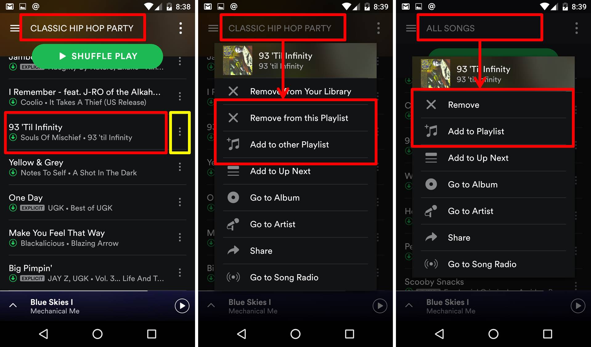
Again, pretty simple, right? The options are right there in the primary view, they’re obvious as all hell in plain English, the (most likely) second most popular thing people do is the second thing on the list, and they even have little icons next to the text in case you’re voting for Trump / can’t read.
Gmail, on the other hand, has decided to take “efficiency” wildly overboard and turn a very straight-forward problem into a fucking treasure hunt.
Here is my view when I’m just looking at a list:

The primary edit option is, as you would expect from this view, Add A Contact to This List. Then there are a bunch of contextual secondary options for list-level editing.
Now, below is what happens when I select a specific contact:

As you would hope, the context dictates a different set of options. Bravo, Gmail – you’ve made it to the pool party. Why don’t you grab a beer and s-…wait, Gmail, where are you going? The diving board? Wait, why? Why do you want to go to the div- Jesus, Gmail just wait a second!!

Ugh.
Well I guess I can’t say I didn’t see that coming.
The reason that I have highlighted the three-headed mutant button in “Dumbfuck Blue” (above) is because, totally unlike the two buttons flanking it (Add A Contact To This List and Email The Contact You’ve Selected), it does NOT trigger a single, simple action, but rather open an interface that then requests several more user decisions regarding List Management for This Contact & Potentially All Other Contacts In the Future:

Are you kidding me? All I want to do is remove a contact from this list and they’re making me play a game of fucking Sudoku?
Ultimately, this is what has to happen for me to complete what is likely one of the top 3 most popular use cases from this interface:
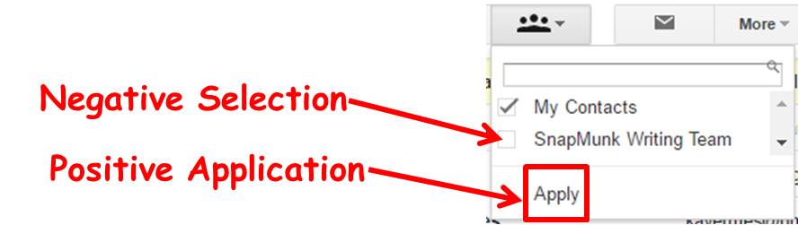
Apply?? APPLY?!?!?! THAT’S THE THING I END UP HAVING TO PRESS AFTER DESELECTING A CHECKBOX TO JUST REMOVE THIS FUCKING CONTACT FROM THE LIST I WAS ALREADY LOOKING AT WHEN I OPENED THIS DICKPUNCH OF A DROPDOWN-ON-STEROIDS THAT’S SANDWICHED BETWEEN TWO SINGLE-FUNCTION BUTTONS?????
Now, this is the point in the article where the super-geeky power-users really start to hate me because I’m bashing a very clever and powerful little tool that no other email interface has. But then comes the point in the article where I remind them that the reason nobody has this tool is because while it gets full marks for functionality (and functional elegance), it gets a big fat fucking doughnut for usability.

Or anything that remotely reads, “Remove Contact From This List” – then figure out how to work in the other options from there. In the world of UX, there is a point at which you are being so smart that it’s stupid.
Some Icing On Top: Gmail Chat
Believe me, I could go on for hours with this stuff, but I’ll spare you the venom and wrap up with a final page from Google’s bestselling UX guide, Why Be Intuitive When You’re Already Richer Than Fuck?
As an editor, it is important that I have access to instant messaging with contributors; with some I use Skype, with others I use Slack, and with the ones that want me to die, I use Gmail Chat.
So the question is: how do you start a chat in Gmail? Well, let’s look at the main interface:

Any thoughts?
Let’s compare this to Facebook:

Can you believe how smart the people at Facebook are? I mean, where do they find these Vulcans with the foresight and logic prowess to use THE WORD, “CHAT” to help users find their way to a chat tool??
So, rerouting the Star Ship Enterprise and heading back to The Planet of the Apes, in Gmail, one way for me to start a Chat with Daniel is to click this thing in the sort-of-but-not-really-bottom-left-ish-corner of my screen that might be a button, but might also just be a rogue quinoa seed from yesterday’s lunch:

So I click that…

And voilà: a list of chat contacts opens up, I click Daniel, and immediately a chat window pops up on the other side of earth.
Excellent.
But how about when I’m reading an email from Daniel? That would be a pretty logical place from which to want to start a chat, right? Let’s see what happens there…

Looks like we have a winner! I’m just gonna go ahead and click on that…

So let me get this straight: when I’m just floating around my Inbox and decide I randomly want to chat with Daniel, I can pull his name up, click it, have a little chat box pop open right away, and then immediately start messaging him. But when I’m reading an email from Daniel that makes me realize I urgently need to speak with him, I have to send him a fucking telegram requesting his permission to keep the conversation going in real time????
Google earned $74.5 billion of revenue in 2015 and has been dubbed literally “The World’s Most Valuable Company”. Give me 0.0001% of that money and 2 weeks of time, and I can get this gangbang of an email UX working half as well as Hotmail.